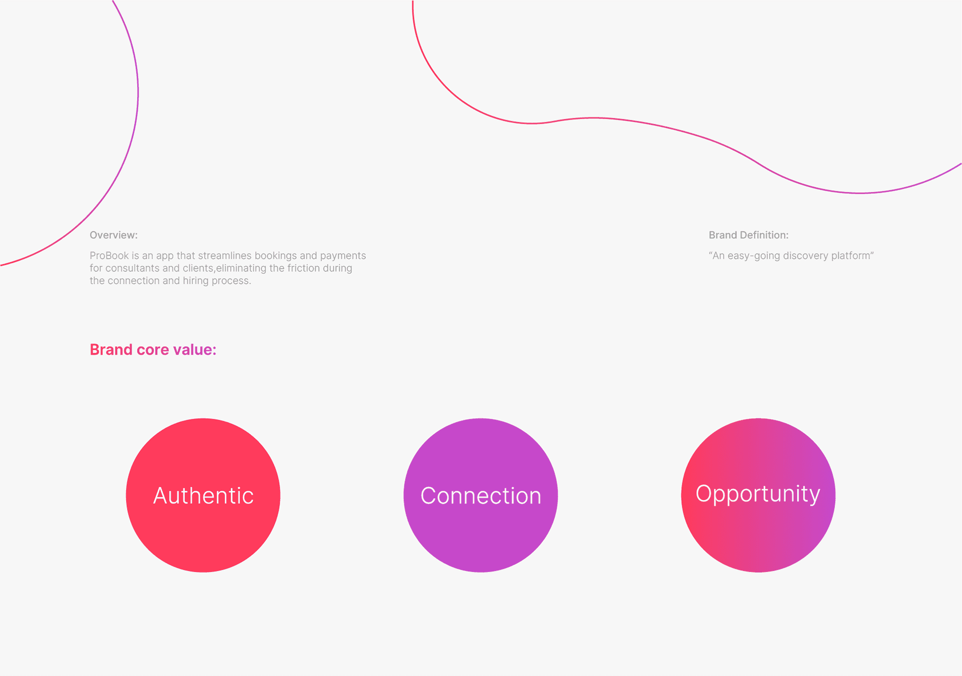
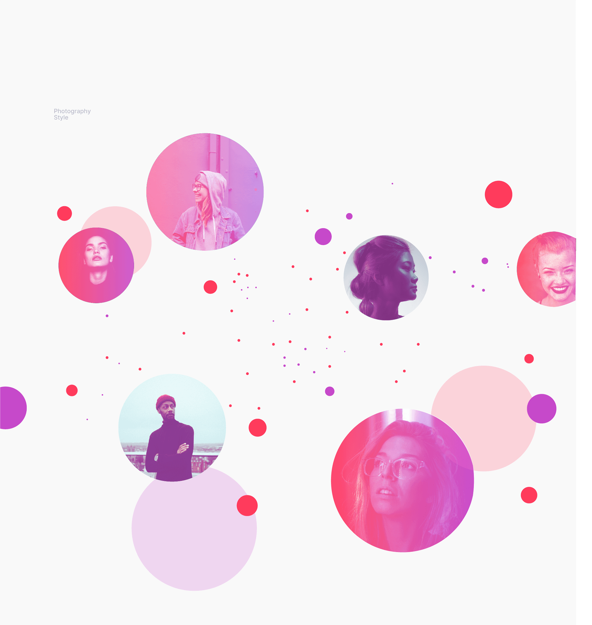
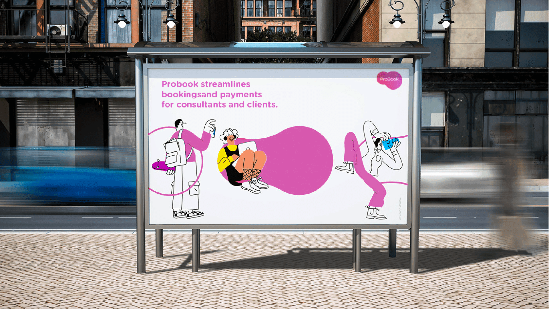
During the process of designing the brand identity for ProBook, my main focus was on creating a sense of an easy-going discovery platform for clients and consultants. We wanted to convey a sense of simplicity and accessibility, while also highlighting the connections that are made through the platform.
The design process included research, sketching, and prototyping. We explored a range of visual styles and concepts, ultimately settling on a simple design that conveyed a sense of connection, communication and professionalism.
The ProBook logo was designed to communicate the idea of a connection between clients and consultants. The fluid circles represent the linking of these two groups, while the soft san-serif font adds a touch of friendliness.
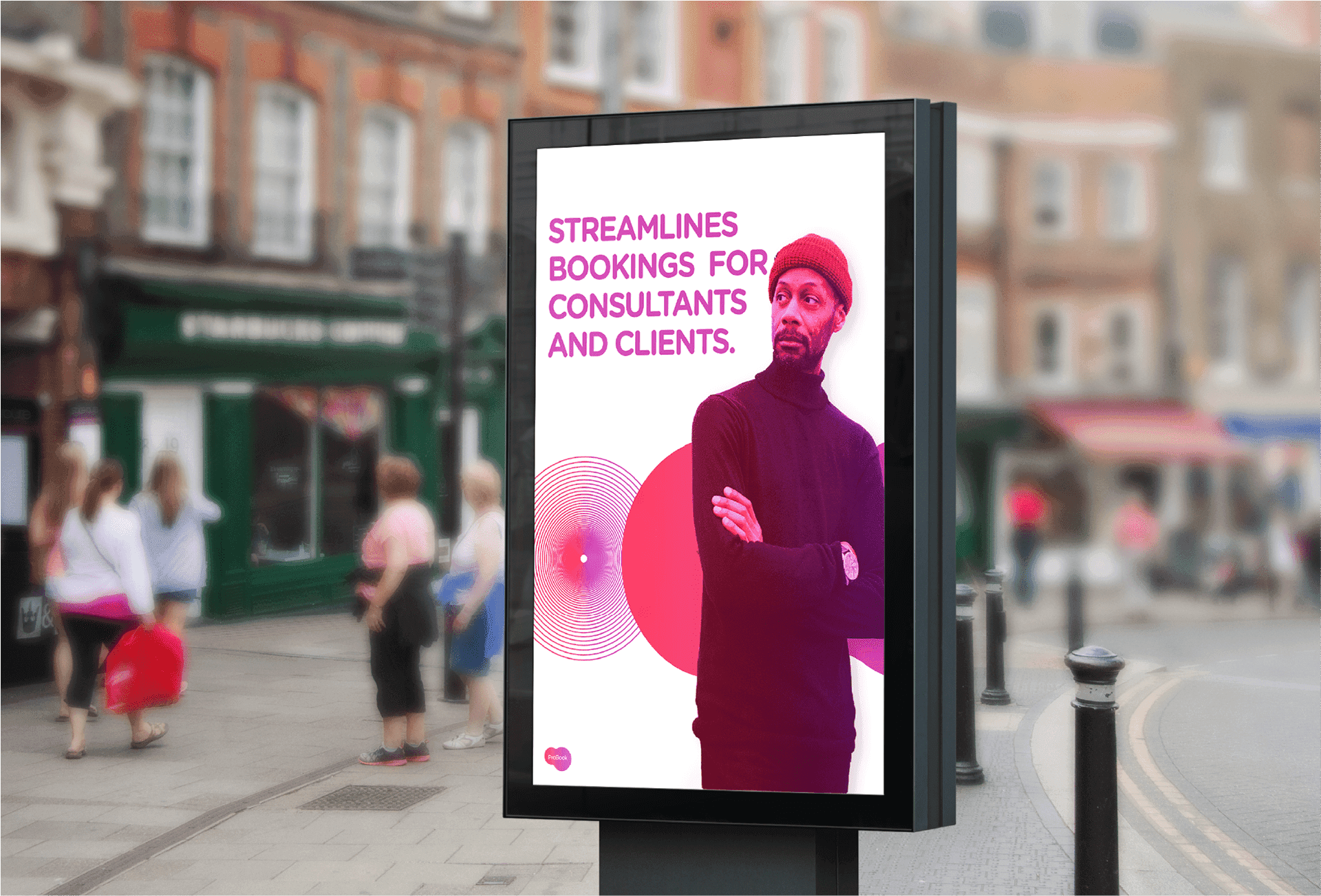
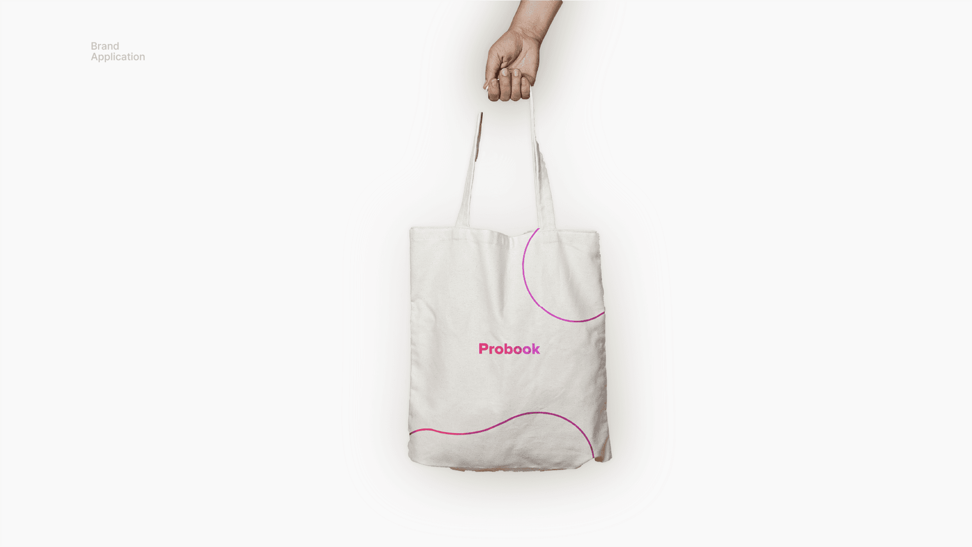
Overall, the ProBook brand identity is meant to convey a sense of ease and accessibility, while also representing the professional nature of the platform. We believe that this visual identity accurately reflects the values and goals of the company, and effectively communicates the unique offering of ProBook to both clients and consultants.

